
Jobs turned the colour of a casing into a statement of principles that still lives on at Apple.
When one of his engineers showed Steve Jobs the ‘final’ colour palette for the Apple II, he must have frowned. More than two thousand shades of beige ranging from light toasted ivory to a cool greyish tone. And with that mixture of demand and obsession that already characterised him, he rejected them. ‘They’re not right.’
That moment, a mixture of excitement about Apple’s first mass-market product and divided opinions, reveals what Steve Jobs was like when it came to aesthetics. Colour wasn’t everything in the Apple II, but it was as important as any component on its motherboard. Or so Jobs must have thought.
Jobs’ obsession with design
This story about the colour of the Apple II, recounted by his biographer Walter Isaacson, expresses how meticulous Steve Jobs was. Despite the design team’s efforts to bring him dozens of colours, he thought it wasn’t enough and decided to take it upon himself to ‘invent’ a new beige that would eventually be adopted for the company’s second computer.
Of all the colours he reviewed, none convinced him. Many seemed too yellow, too grey or too flat. They were all ‘too’ something and failed to win over the demanding co-founder. He wanted a beige ‘with character’ that didn’t look like it had been taken from a mould.
This dedication to the ‘hidden side’ of design was not anecdotal. Jobs often quoted a lesson from his father, who said something like, ‘When you build fences or furniture, even the back part that no one would notice should be well finished.’ In the Apple I, which was created entirely by Steve Wozniak, Jobs also insisted that the layout of the chips on the board should not be a jumble.
For Jobs, this was not simply a taste for aesthetics. It was a manifestation of his deepest principles. Design was not just a pretty shape or colour. It was not just skin or interface. It was a set of elements in which each and every one had to have a purpose. Even if they were invisible or seemed minor to most people.
Beyond the Apple II
We already noted that the Apple II colour episode was not an isolated incident. Jobs’ obsession with detail was present in every aspect of the design. When the first Macintosh was in development, Jobs demanded that the internal circuits be aligned aesthetically, with no crossed wires or messy components, even though the end user would never see them.
He also demanded that the visible screws on that legendary first Macintosh be the same colour and exactly the same as each other. Same length and finish. And if it didn’t look right to him, he rejected it. He believed that a single screw could affect the whole.
And while those demands could create tension among Apple employees, they also generated an almost fanatical loyalty. Those who worked with Jobs understood that it was not a whim but a matter of brand principles. That tension between the artistic and the technical, between the ideal and the feasible, was a constant throughout his professional life.
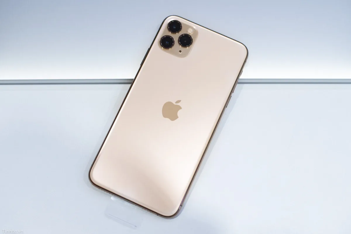
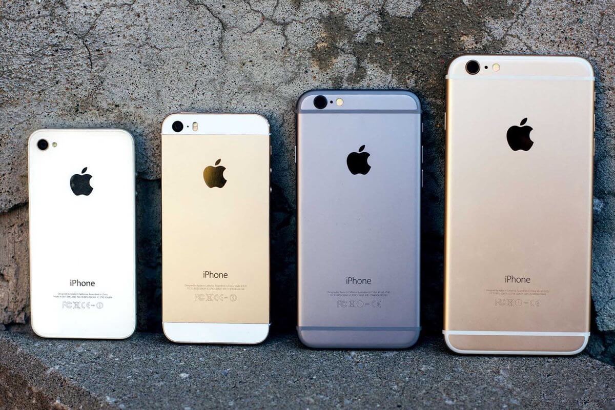
Perhaps that is why Steve Jobs was captivated by the ingenuity of Jony Ive, who was the company’s head of design from his return in the late 1990s until his departure six years ago. Apple has continued to emphasise design and even the smell of its boxes, becoming a staunch defender of it. Although sometimes they have had to sacrifice it for the sake of utility.